


Beyond Presence Design System
# AI-Powered Design System
{Beyond Presence}
{Conversational AI}
Beyond Presence is a global research company specializing in real-time conversational AI avatars. Their developer platform allows the creation and deployment of hyper-realistic AI video agents.
Design System
[ Why we've built a Design System]
After public launch of the No-Code studio and noticing such MV issues as UI styles inconsistencies, duplicated components , and design-dev gaps, we decided to establish the Beyond Presence Design System from scratch.
[ Collaborative Goal & My Role ]
Beyond Presence Design System aimed to streamline both product design process, to enable faster shipping, UI consistency and product scalability. I’ve led the strategy and execution of the Beyond Presence Design System that we’ve built up completely from scratch.
[ Deliverables ]
Design System (Figma file), Foundations (Design Tokens), Component Library (Figma), Patterns & Layouts Documentation.
[ Outcomes ]
- Reduced design-to-dev time through a synchronized Storybook component library
- Faster feature delivery by standard UI components
- Improved product UX/UI consistency
- A scalable UI foundation for future product growth
- Decreased UI-related QA issues
- Faster feature delivery by standard UI components
- Improved product UX/UI consistency
- A scalable UI foundation for future product growth
- Decreased UI-related QA issues
How we've built it
UI System Audit
We started with an audit of the existing MVP UI to identify component inconsistencies, weak UX patterns and product-specific components. This helped us understand what could become reusable Design System elements and where unification would have the biggest impact.
Defining Foundations
Before building components, we defined the core foundations of the system, tokens like colors, typography, spacing & layout, border radius, and naming conventions. This helped us to create a consistent framework that ensureв the interface scalability in a predictable way as the product grows.
Component Architecture
With the foundations in place, we designed a modular component library covering reusable UI primitives, compound components and composite/ domain components. Each component was built multi-themed, with structured variants and light & dark modes.
Agent-specific Patterns& Guideines
Considering the Agentic AI nature of the product I’ve established a separate Design System category that included Agent - Specific Patterns, components and guideines
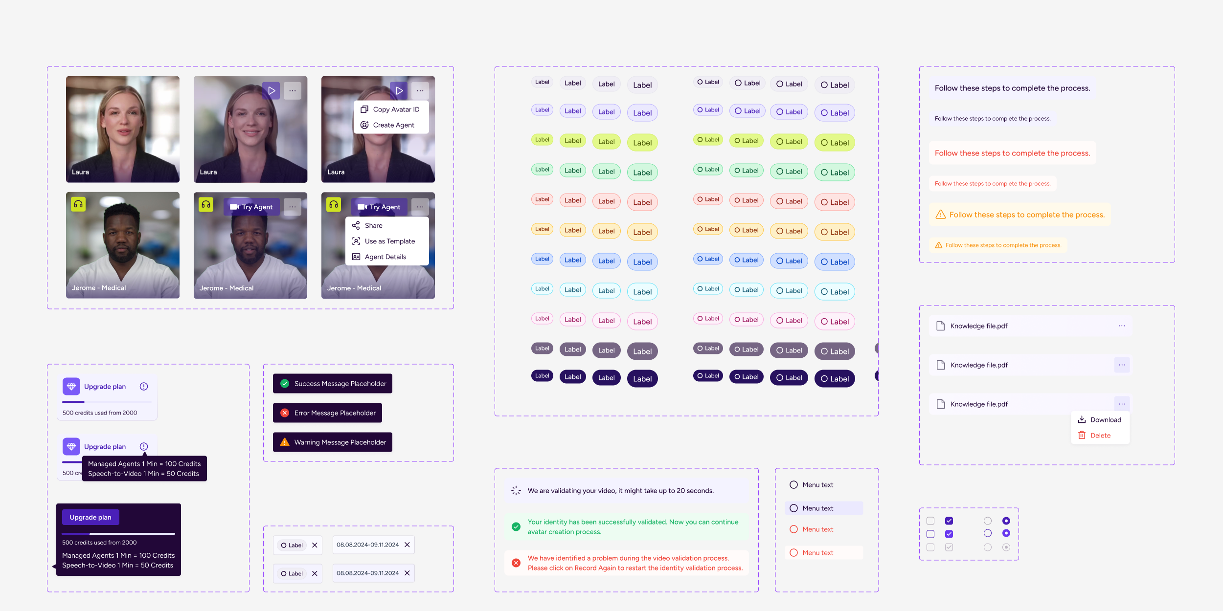
Documentation & System Adoption
Once the core library was established, we documented components, usage guidelines, and interaction patterns to support consistent adoption across the team. This made it easier for designers and developers to reuse components and scale the system as new features were introduced.
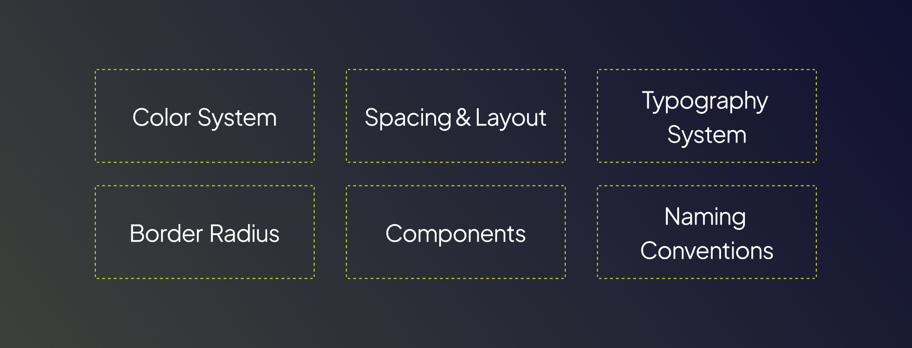
Foundations
The Design System foundations we’ve established define the core rules determining color pallete, typography, spacing & layout, border radius, component structure, and naming conventions. By standardizing these categories early, we created a scalable and multi-themed system that supports UX/UI consistency, product scalability and implementation speed.
Light & Dark Modes
We initially launched the MVP in light mode to support a broader audience. As our ICP became clearer: technical teams and developers integrating AI agents, we decided to introduce dark mode. Design Tokens and Components were designed to respond to theme variables.
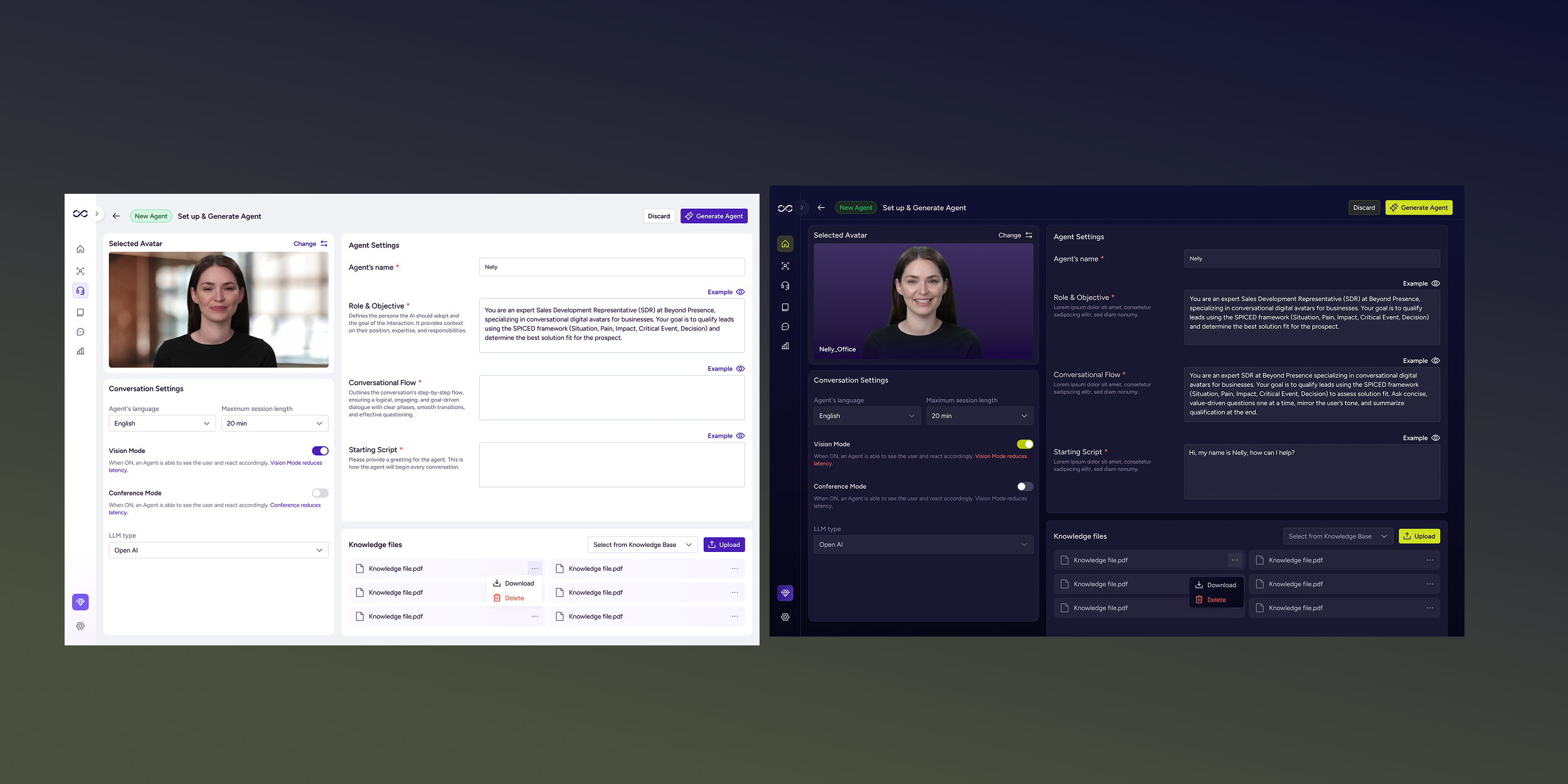
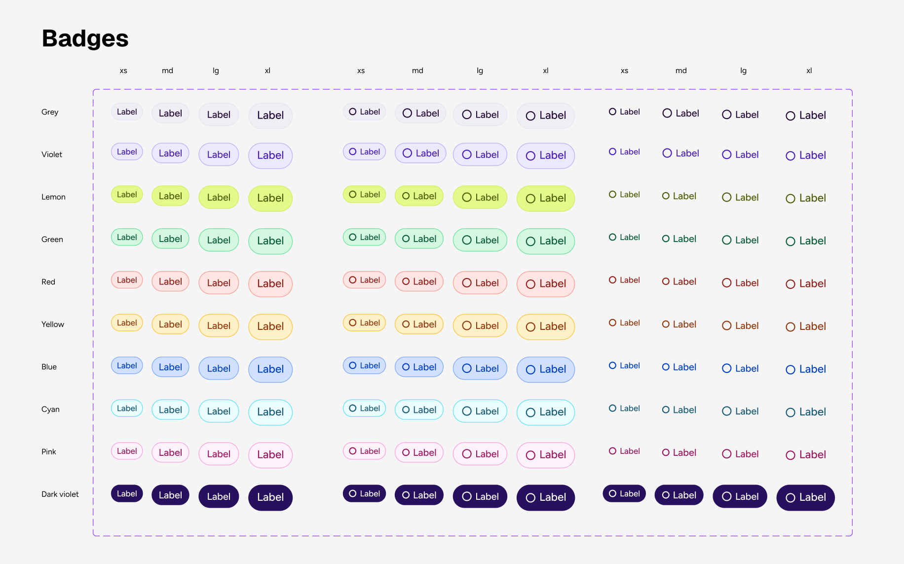
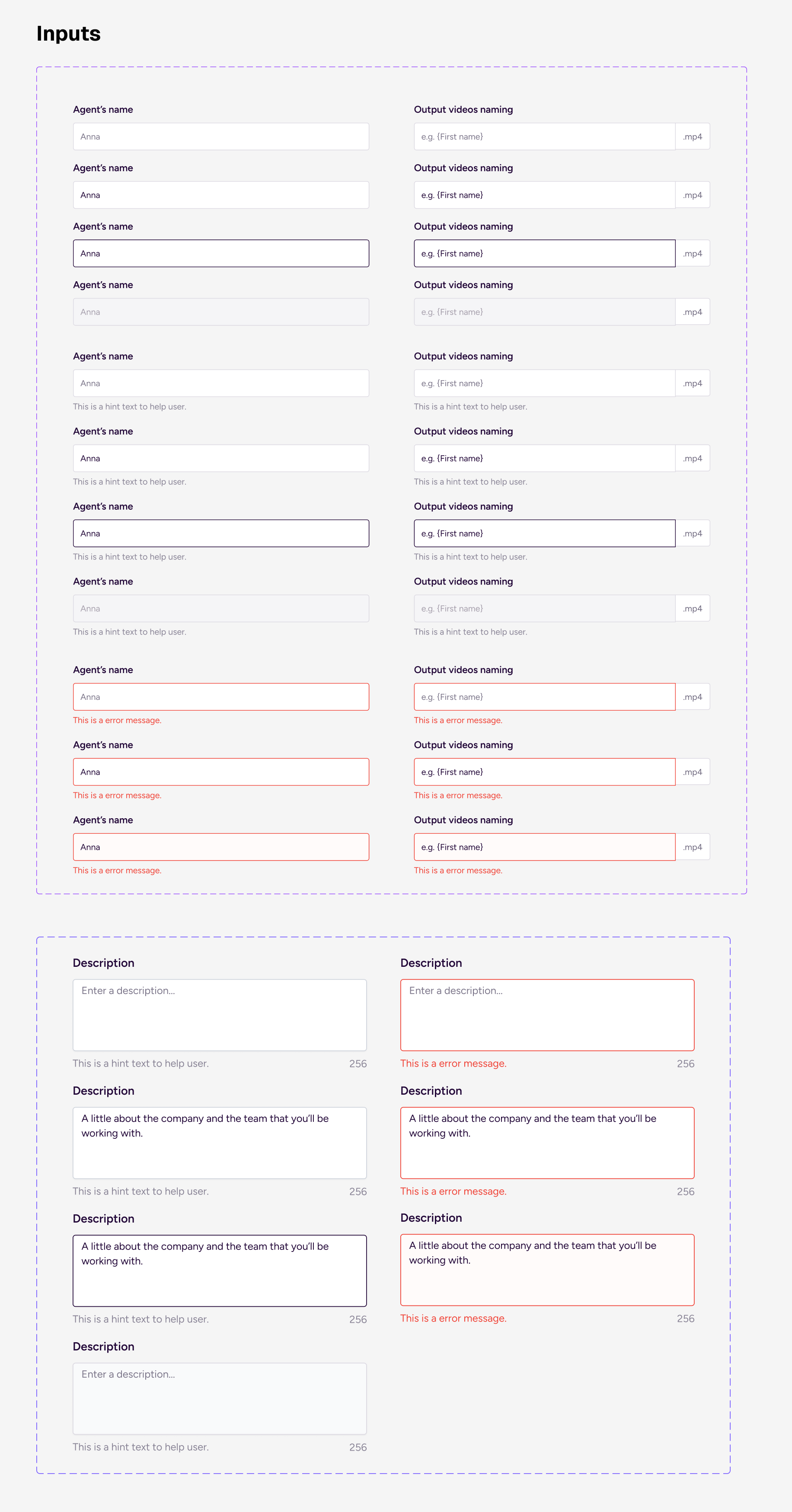
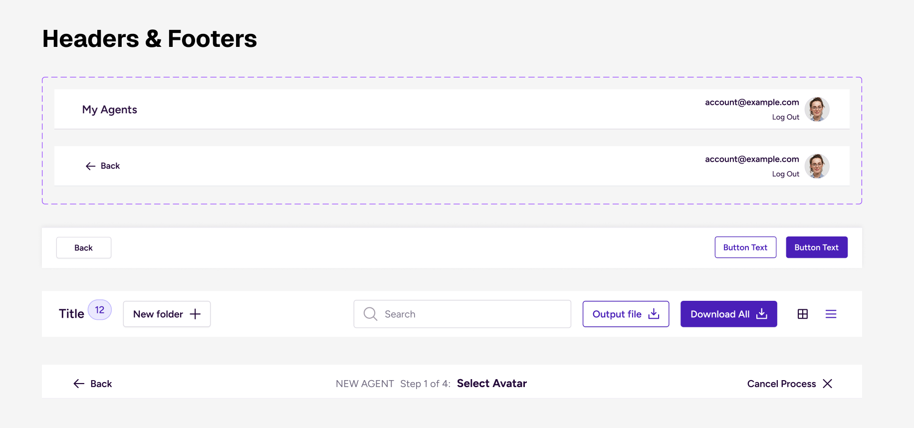
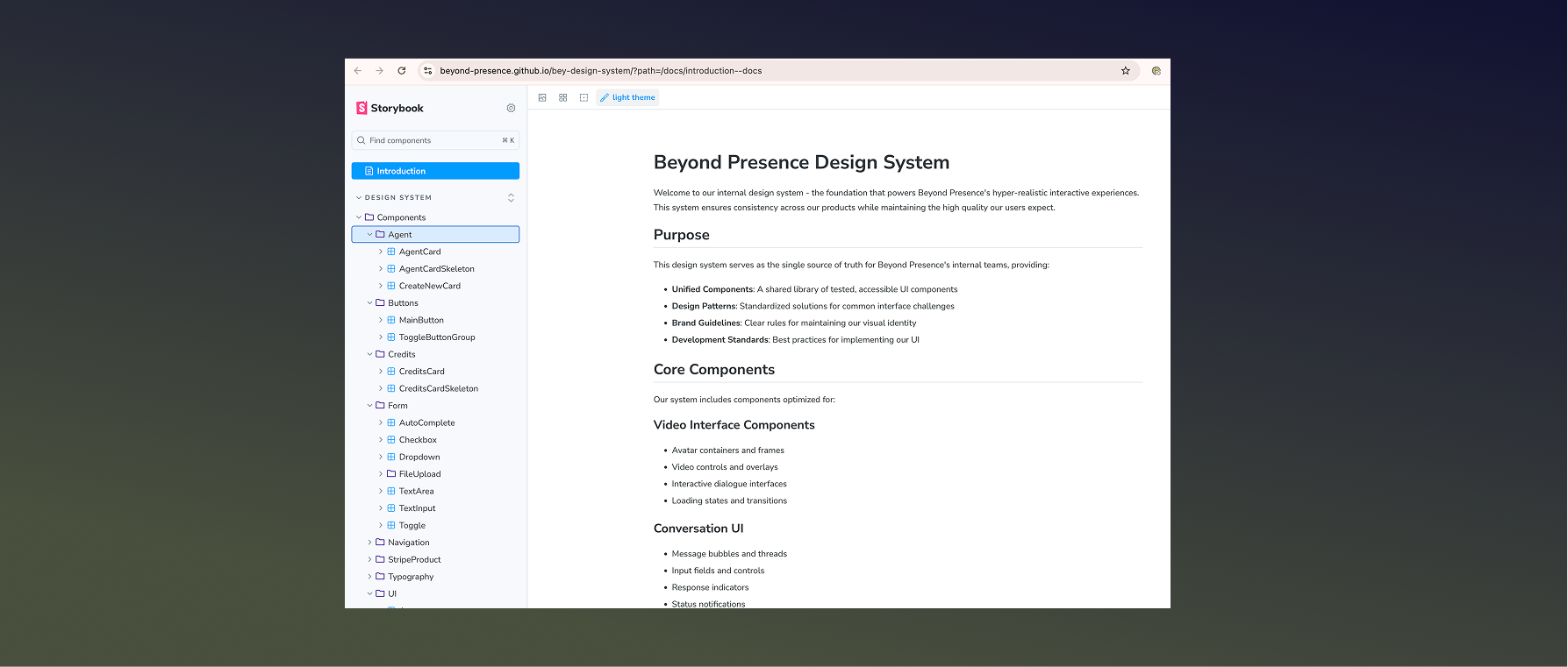
Core components
We designed the component library as a scalable set of reusable UI primitives, compound components and composite/ domain components. Each component was built multi-themed, with structured variants, clearly defined states to ensure predictable behavior across light and dark modes, while aligning closely with front-end implementation.
[ Primitive Components]
Low-level UI primitives forming the base of the system:
•Buttons
•Inputs
•Checkboxes
•Badges
•Toggles
•Icons
•Avatars
•Buttons
•Inputs
•Checkboxes
•Badges
•Toggles
•Icons
•Avatars
[ Compound Components]
Combinations of primitives with shared logic:
• Dropdown (Input + List + Icon)
• Form Field (Label + Input + Validation + Hint)
•Search Bar
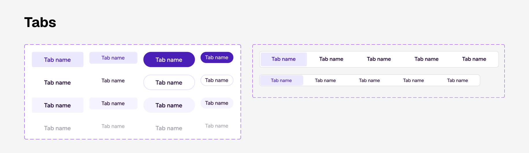
•Tab Navigation
•Tooltip
• Dropdown (Input + List + Icon)
• Form Field (Label + Input + Validation + Hint)
•Search Bar
•Tab Navigation
•Tooltip
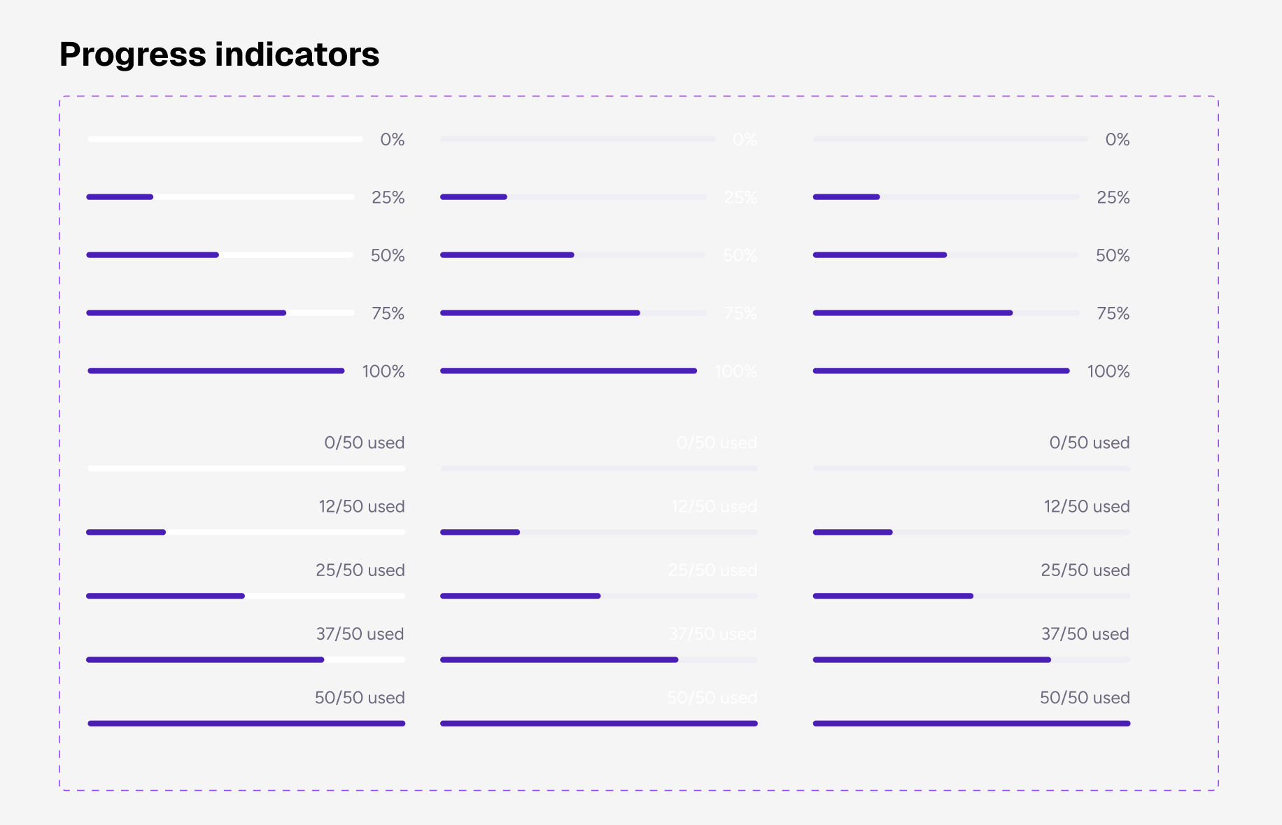
[ Composite / Domain Components:]
• Data Table
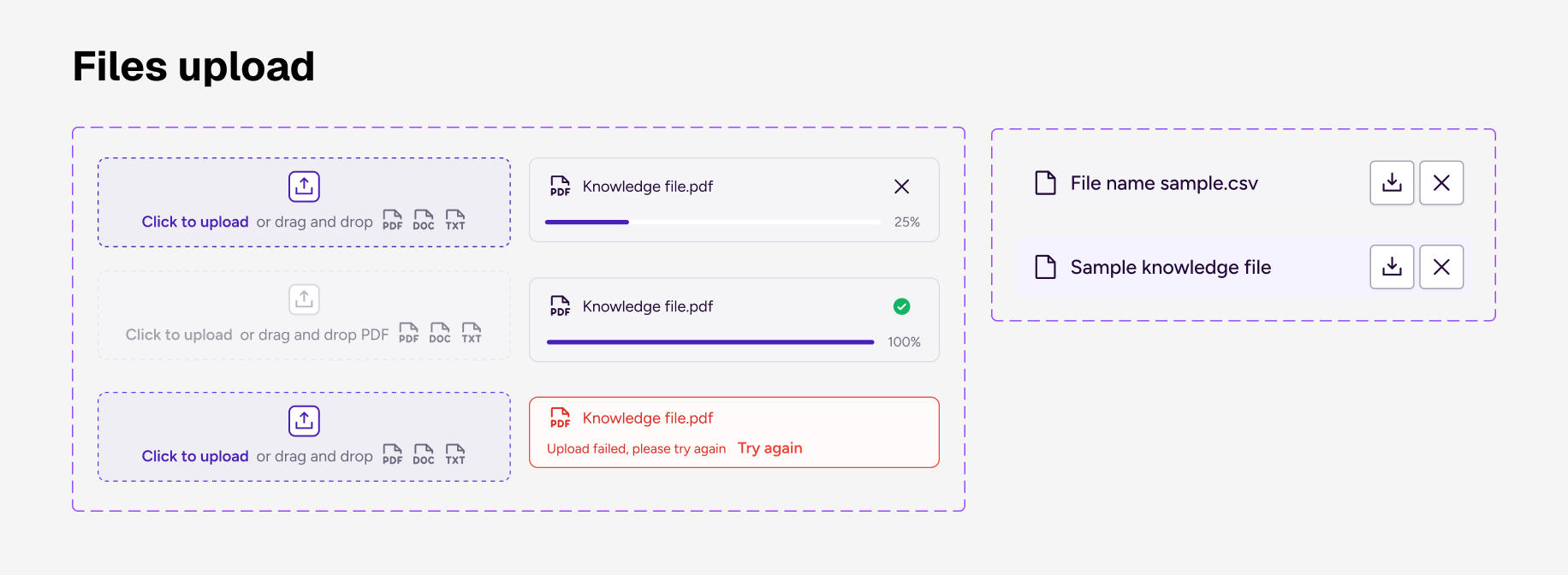
• File Upload Module
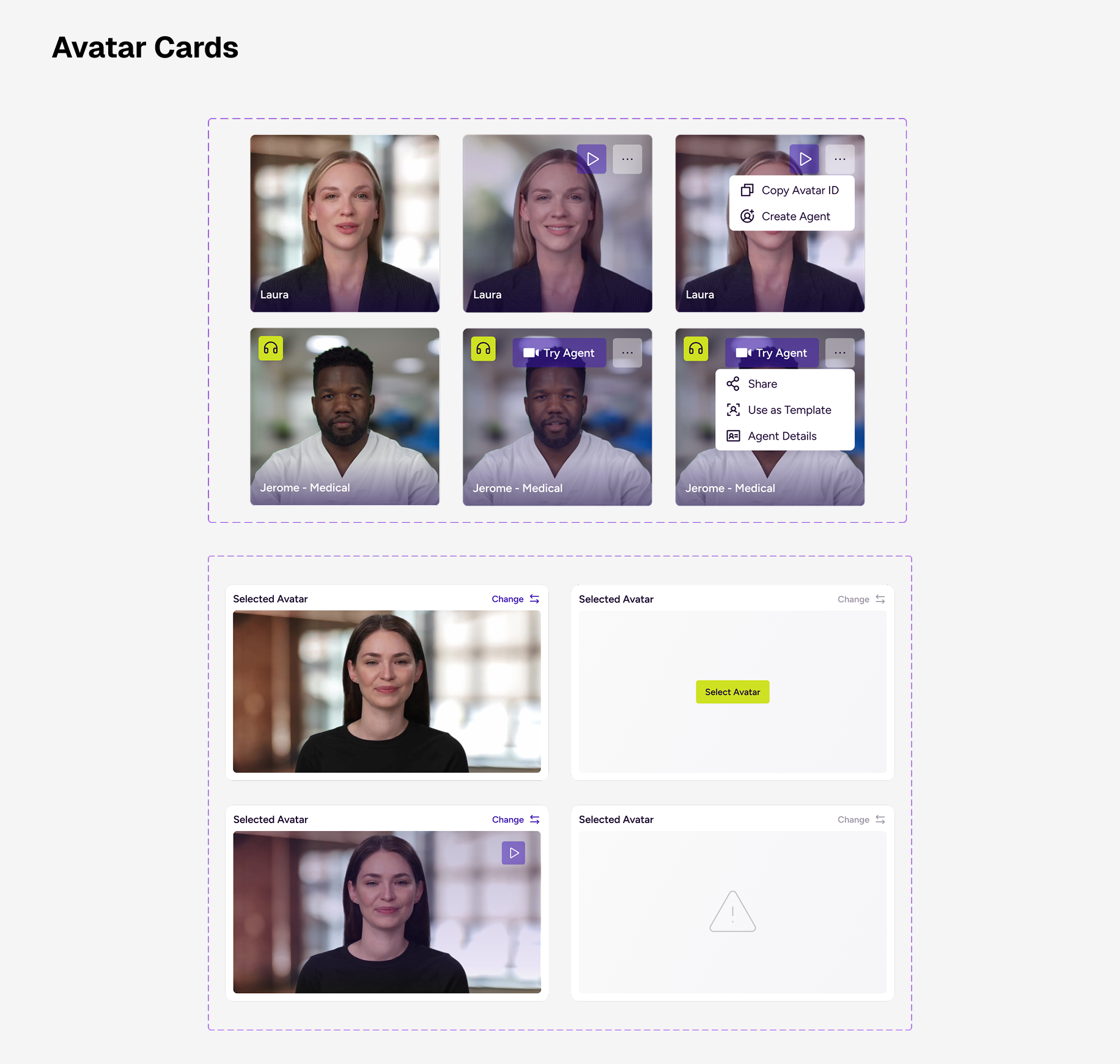
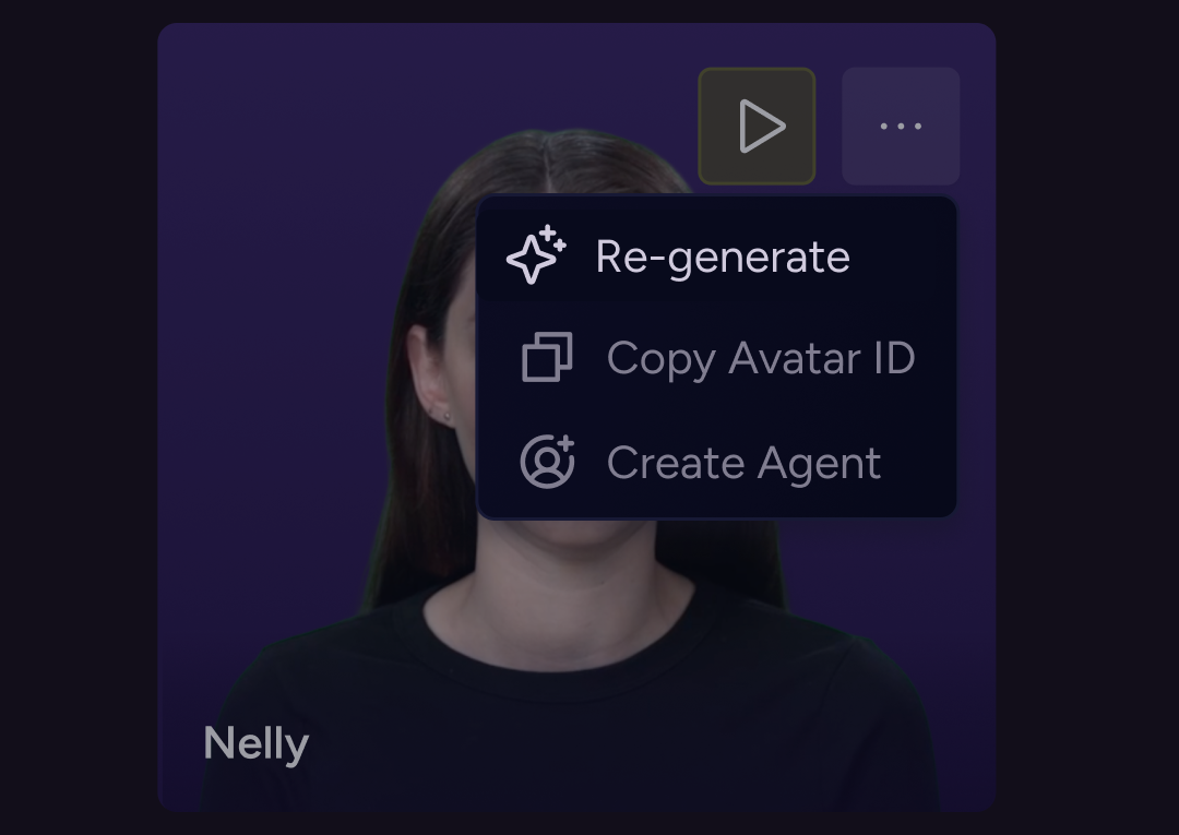
• Agent Avatar Card
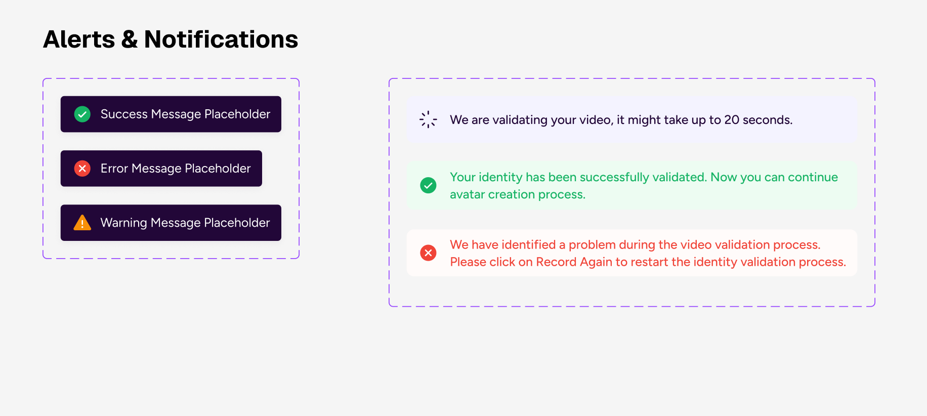
• Alert System
• Progress Tracker
• Message Thread
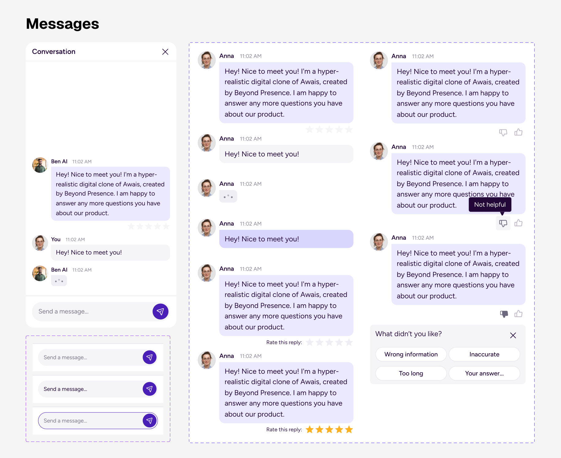
Agent-specific Patterns & Guideines
Trust & Transparency patterns
We’ve came up with these patterns to help users feel informed, in control, aware of the system behavior: , Streaming response indicator , Progress bar for long tasks, Editable generated content, “Regenerate” button, etc
Conversational UI Patterns
Patterns that define how users communicate with the agent: multi-line prompt field, prompt templates, Attachment support (files, links, data sets), chunked answers (sections, collapsible blocks), Highlighted key results, Structured data rendering (tables, cards, graphs), Timeout handling, Offline mode, Waiting for input, Error state, Conversation history panel
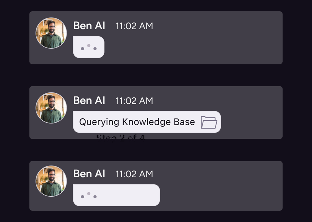
AI State Handling
Responses from the system that reduce uncertainty.Thinking / analyzingStreaming responseFetching external dataRunning toolMulti-step execution (“Step 2 of 4”)Large dataset processingAnimated status indicatorSub-status labels (“Querying database…”)
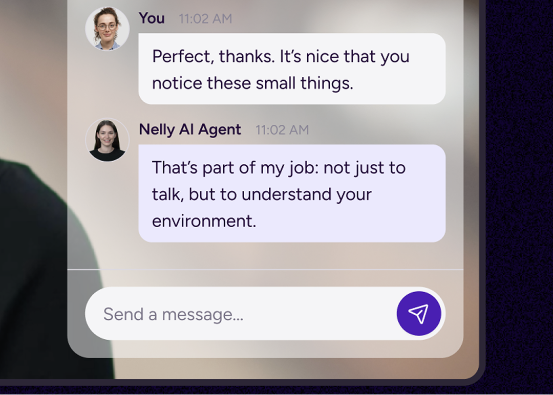
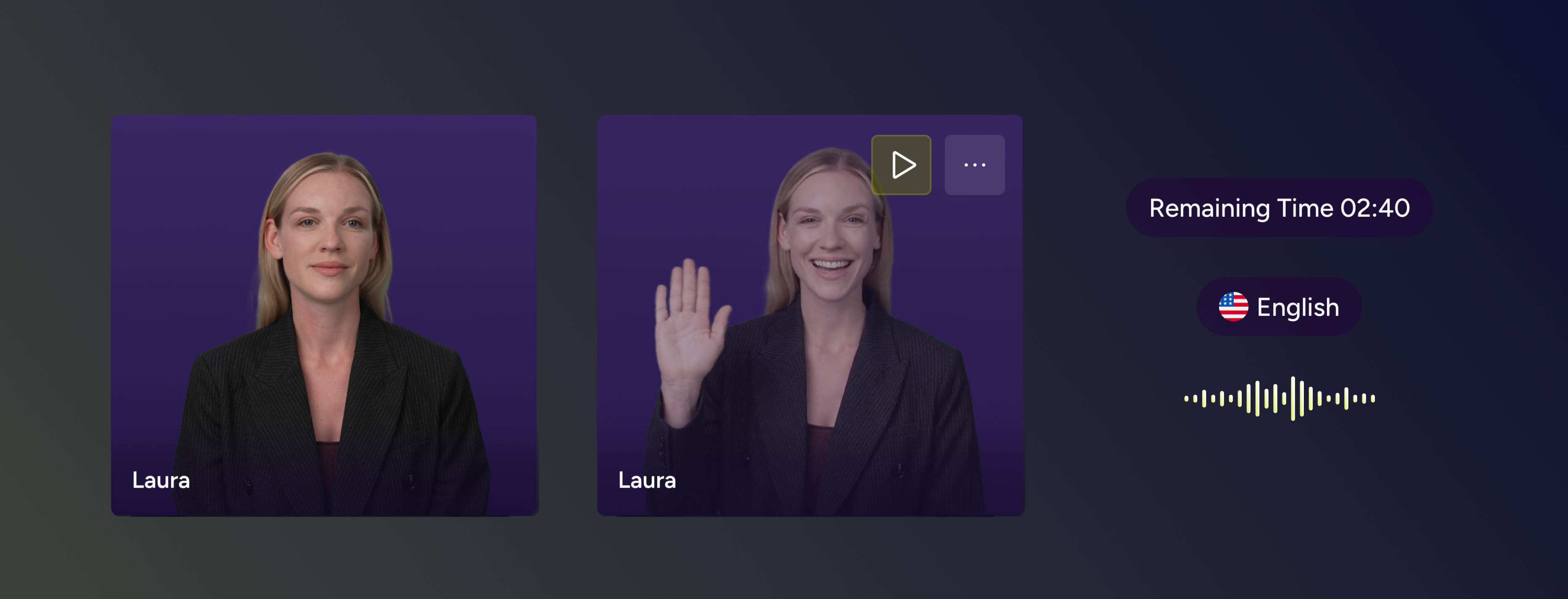
Real-Time feedback patterns &Embodied AI Responsiveness
These patterns support reduce silence anxiety, reduce uncanny valley discomfort, reduce latency uncertainty, increase responsiveness from the system, emotional aspect and enhances Agent’s states + anything that manages time perception: skeleton loaders, responsive avatar microinteractions, live timestamp indicators, “Last updated” labels, Idle animation state, Listening state, vision mode, Background noise warning, Session ending warning, Inactivity timeout warning, Resume session button.
Dev Alignment
The system was developed in close collaboration with engineering to ensure design and implementation stayed aligned.
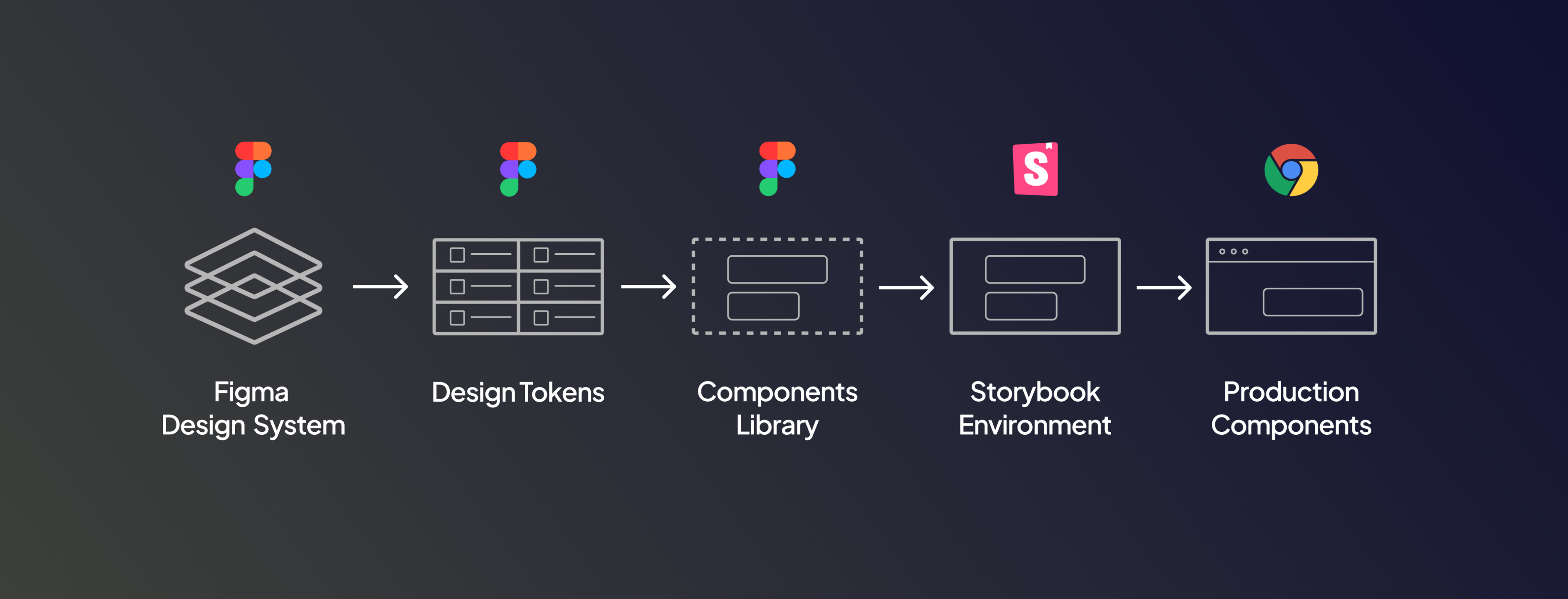
Storybook integration
The design system was integrated with Storybook to ensure alignment between design and implementation, while Claude-assisted workflows helped automate updates and maintain consistency between design and code.
UI Component Parity
Design components mapped directly to front-end implementation in Storyboo.
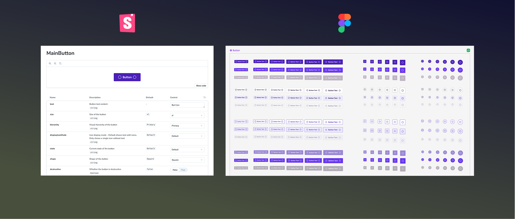
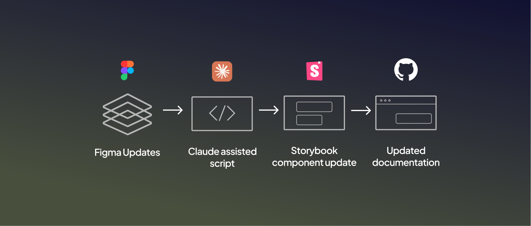
Claude Automation
Design components mapped directtly to front-end implementation in Storybook.
Outcomes
Faster product development
Improved consistency across the product
Reduced design–development friction

Better scalability for new features

How we’ve built it
[ step 1 ]
Design & Build
We translate strategy into visual systems, digital products, and interactive experiences — always crafted with clarity, edge, and purpose.
[ step 2 ]
Design & Build
We translate strategy into visual systems, digital products, and interactive experiences — always crafted with clarity, edge, and purpose.
[ step 3 ]
Design & Build
We translate strategy into visual systems, digital products, and interactive experiences — always crafted with clarity, edge, and purpose.
[ step 4 ]
Design & Build
We translate strategy into visual systems, digital products, and interactive experiences — always crafted with clarity, edge, and purpose.
[ step 5 ]
Design & Build
We translate strategy into visual systems, digital products, and interactive experiences — always crafted with clarity, edge, and purpose.
[ step 6 ]
Design & Build
We translate strategy into visual systems, digital products, and interactive experiences — always crafted with clarity, edge, and purpose.
{ceo}
Angeline Sora
“ Anna has achieved a masterful blend between Innovation, Product, and UI/UX Design. We worked together when she was part of ecoplanet as a Product Designer and I really enjoyed our mutual collaboration in the workspace building our next-gen Energy Management System. She brings a lot of fresh and powerful ideas, concepts, and methods; and she is very knowledgeable in what she does. ”

How we’ve built it


© 2026 Anna Tyrkich
